Range of activities:
Branding
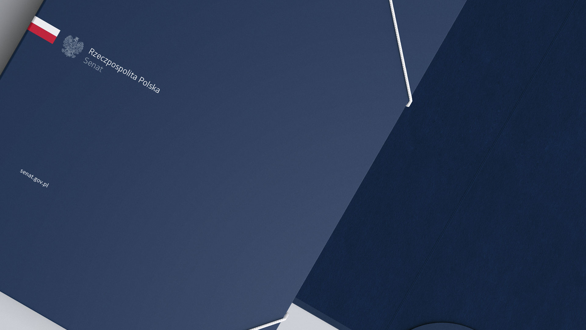
Senat RP
Visual Identification of the Senate of the Republic of Poland and the Chancellery of the Senate
Senate of the Republic of Poland
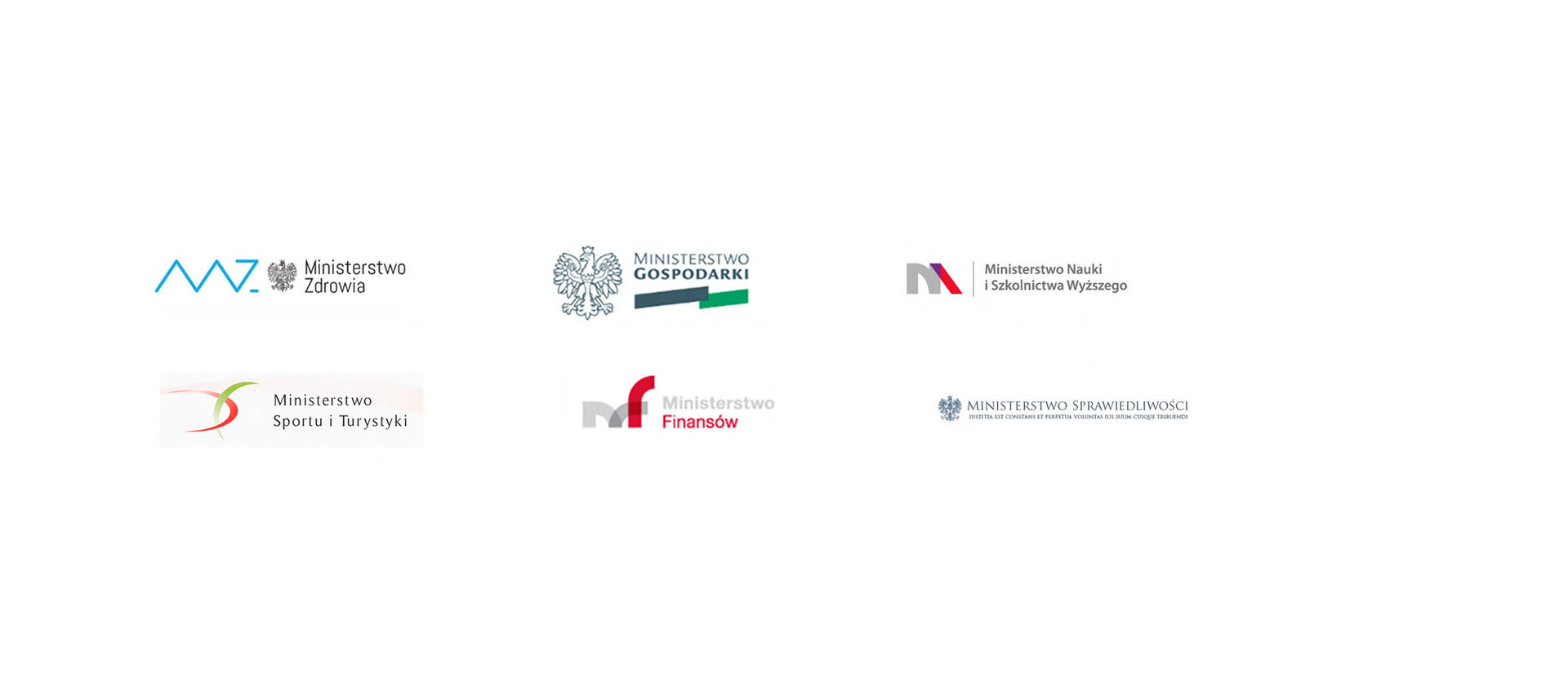
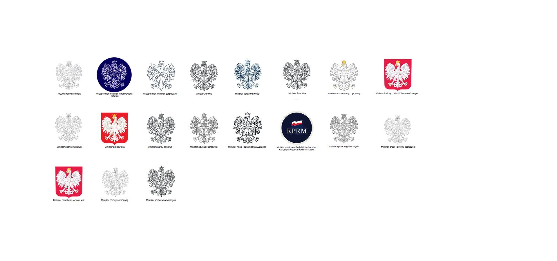
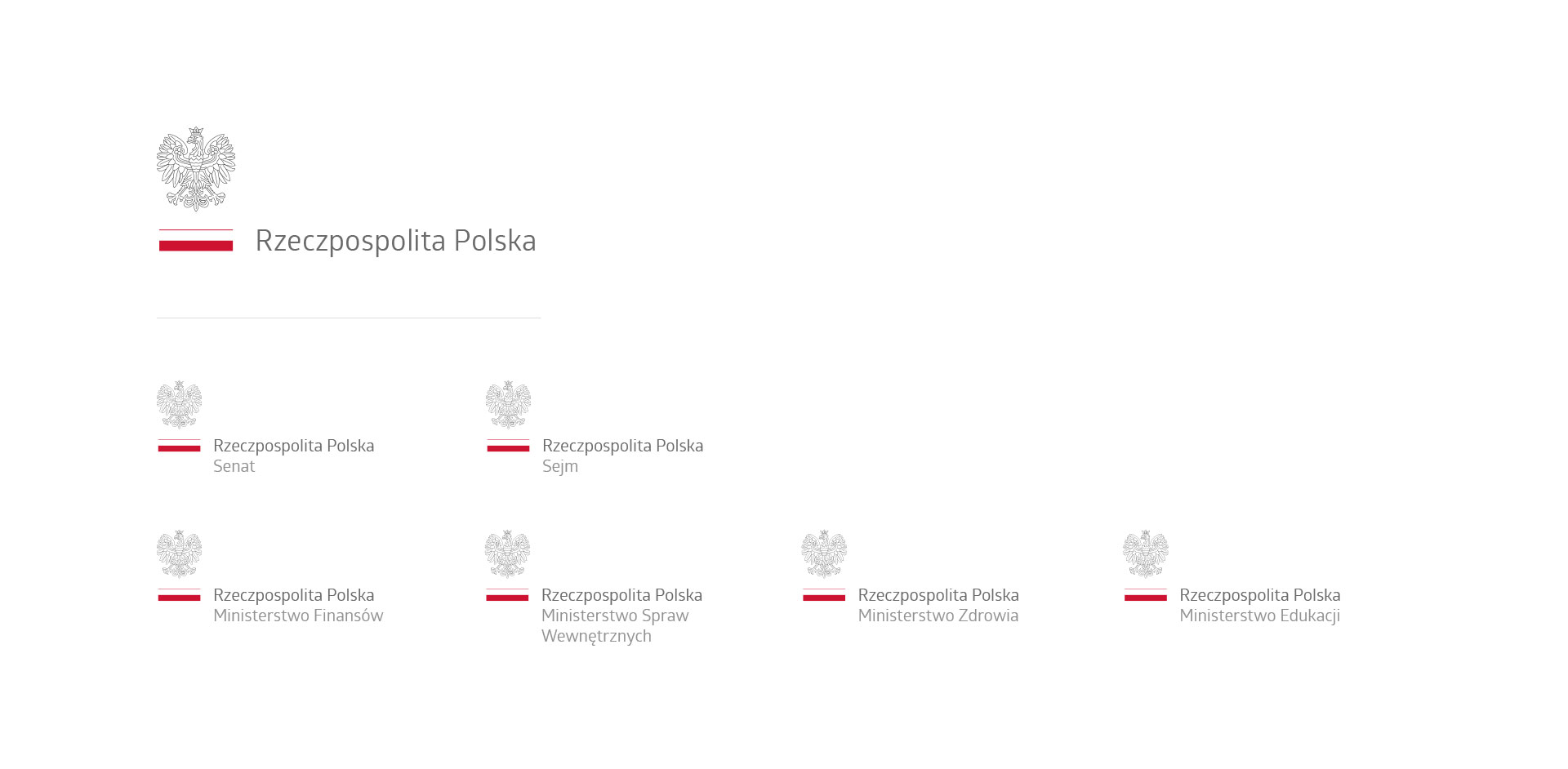
We took part in competition for best corporate identity, organized by Polish Parlament. It was inspiring and valueable experience. We noticed a lack of visual’s coherence. Every part of the Parlament has a different logo, despite of they have one purpose. Citizens mustn’t feel the discord, when they see a national’s symbols. We aimed to achieve an essence of the issue, trying to make something coherent and respected. We wanted to create frames of visual’s identity for harmony appearance of Polish’ Parlament. The primary icon based on White Eagle and Polish’ flag. It should evoke emotions: proud and respect. The typography must be readable and associated with dignity.
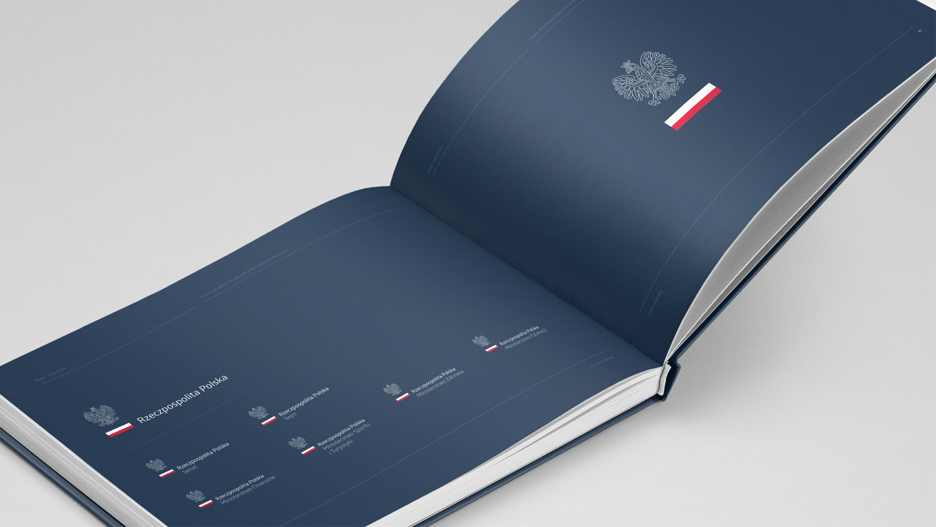
We started to analyse the basic corporate identity and we found out there is no coherence. Every single institution has different icon but they do not compete each other. They have one purpose: to work towards people. We knew, our realization should be perfect for every departments of Polish’ Government. Citizens mustn’t feel the discord, when they see a national’s symbols. We aimed to achieve an essence of the issue, trying to make something coherent and respected. We wanted to create frames of visual’s identity for harmony appearance of Polish’ Parlament.
The substantive consideration was the most important for us. The issues were: the accessibility, transparency and coherence.
The lack of accessibility was the result of closed communication’s space. Citizens could not understand what the government want to say. The lack of understanding affected by values which are not important for them. We can solve this problem by our coherence realization.
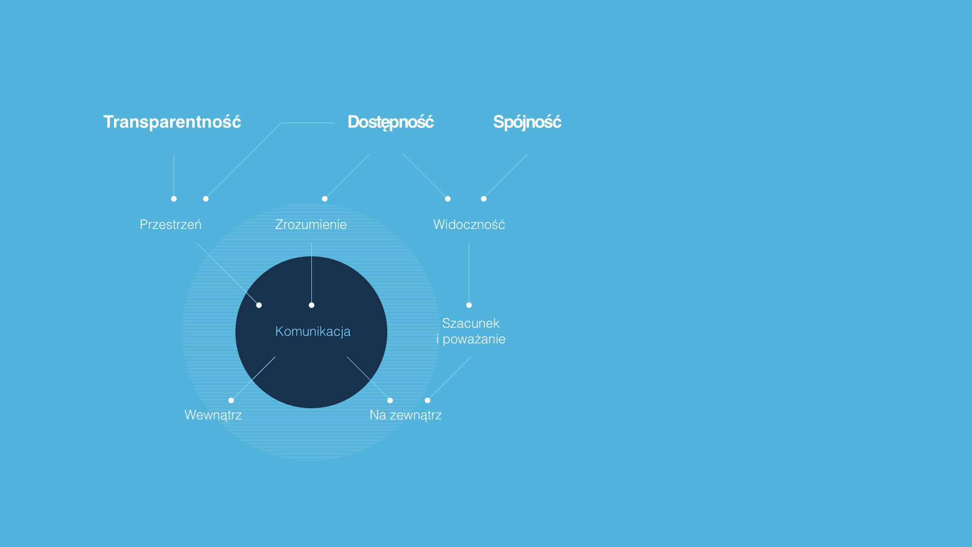
The transparency is an ability to give full information. The lack of coherence makes mistrust authorities and reluctance to parlament. We wanted to create the frames of corporate identity, which could be useful and makes the government reliable and close to citizens.
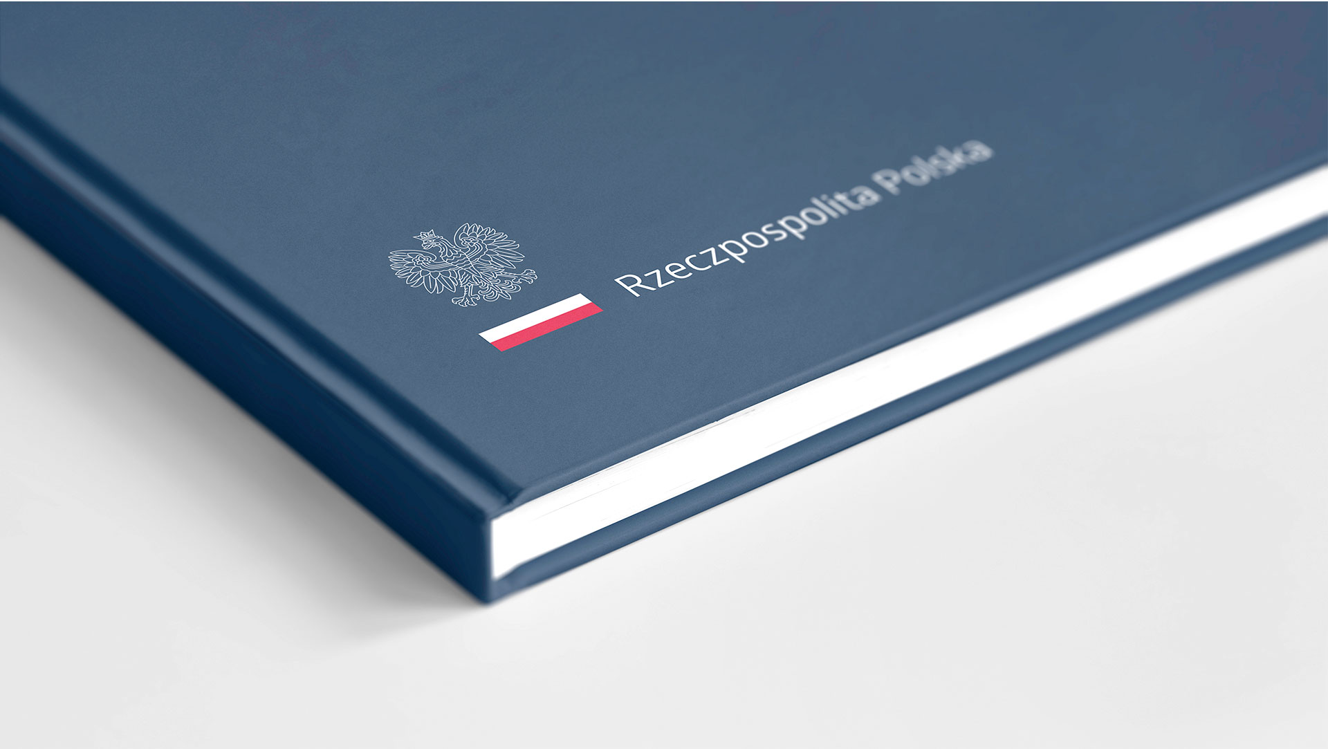
The primary icon based on White Eagle and Polish’ flag. It should evoke emotions: proud and respect. The typography must be readable and associated with dignity. We cares about the exposure of White Eagle and the Flag. The Flag is located an equal level of the name of the country. It’s got more depth, better color saturation than the department’s name. It shows that every single institution works for Poland.
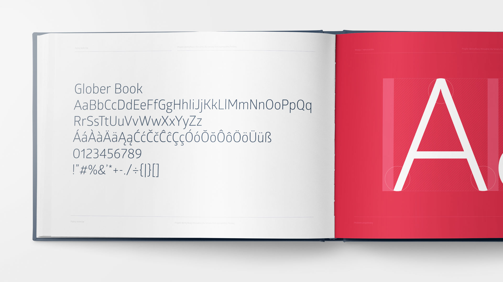
We used Calibri font but we chose the Cambria as a substitute font – it can be use in official and special letters.
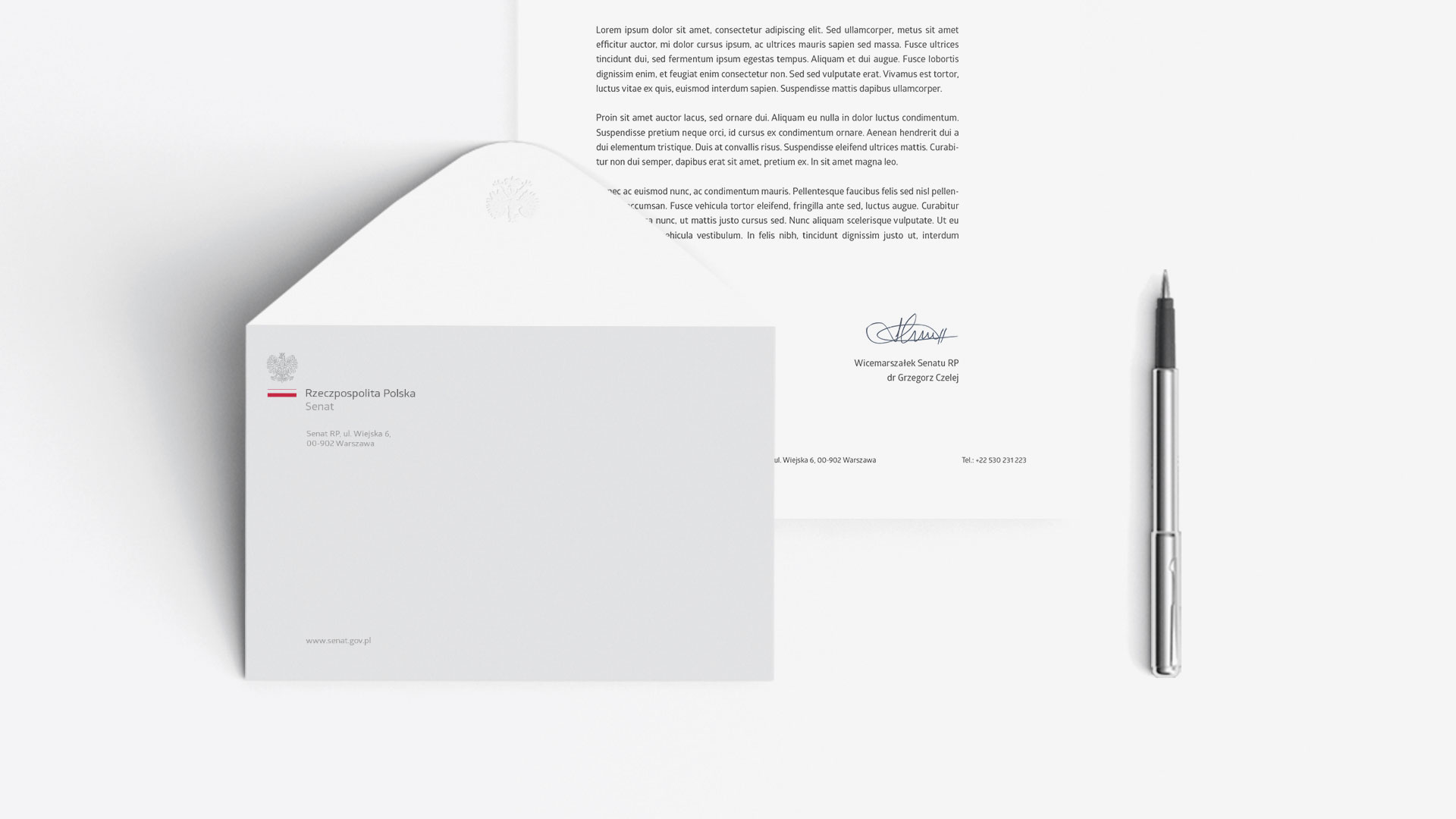
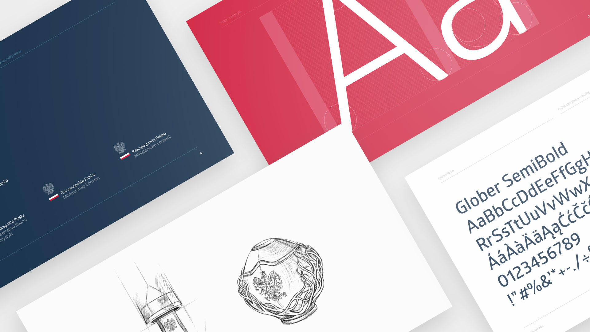

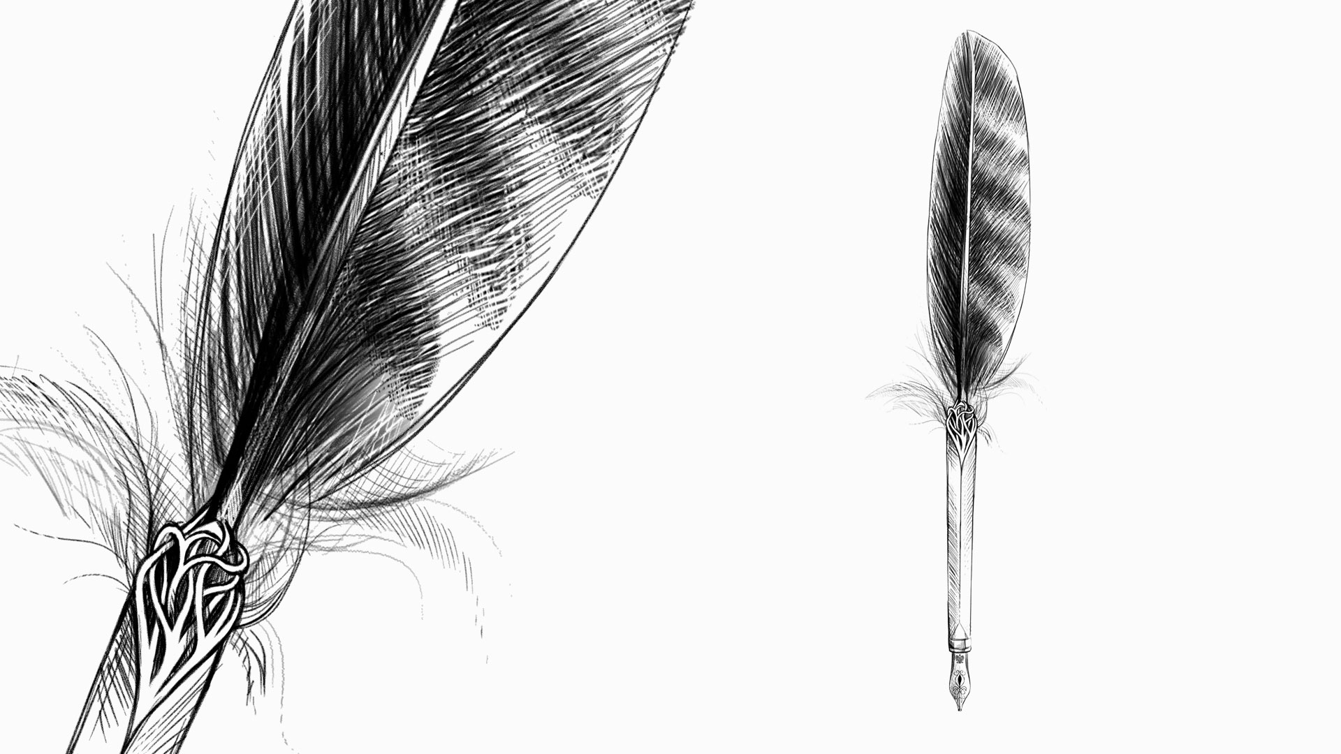
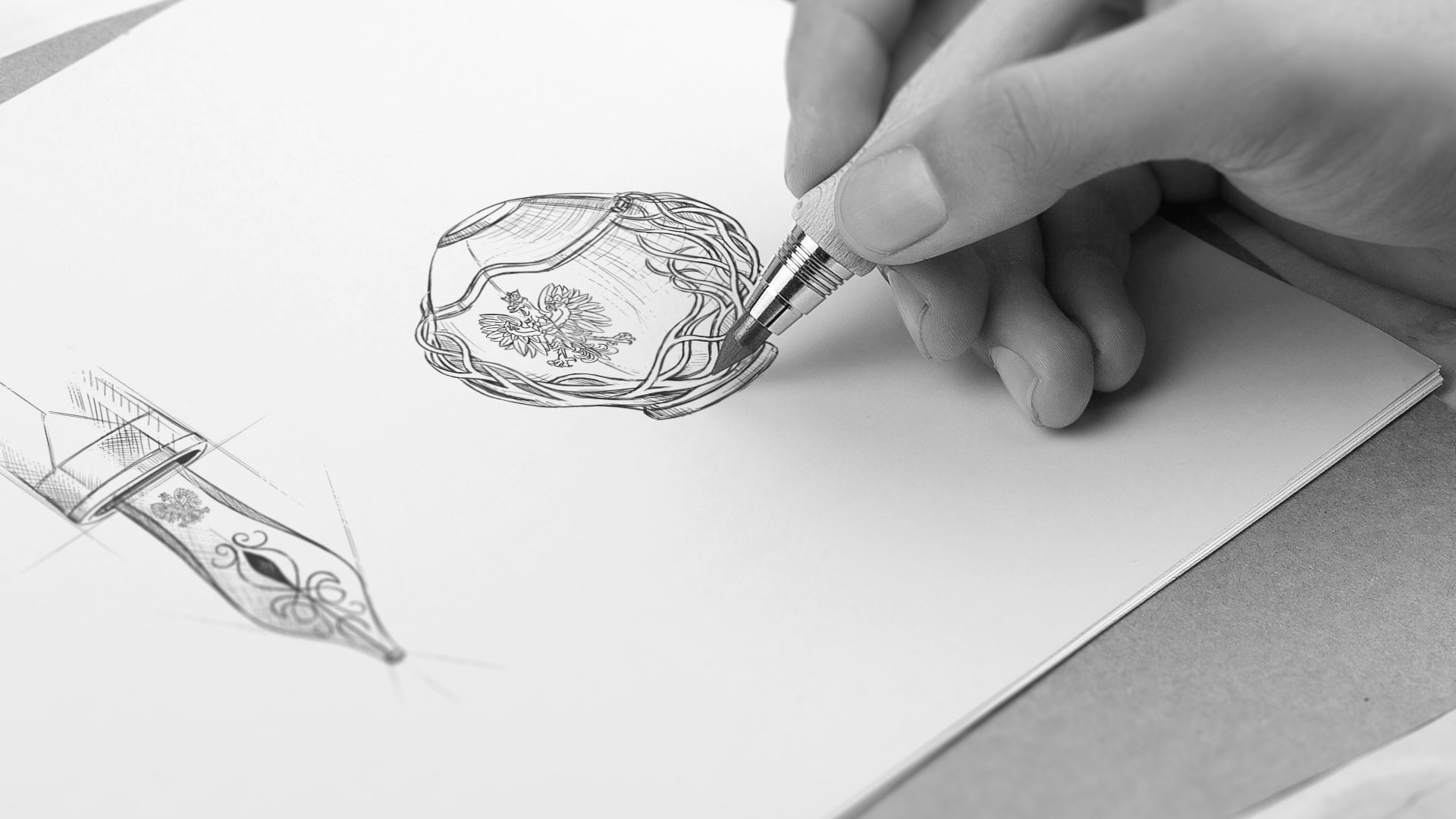
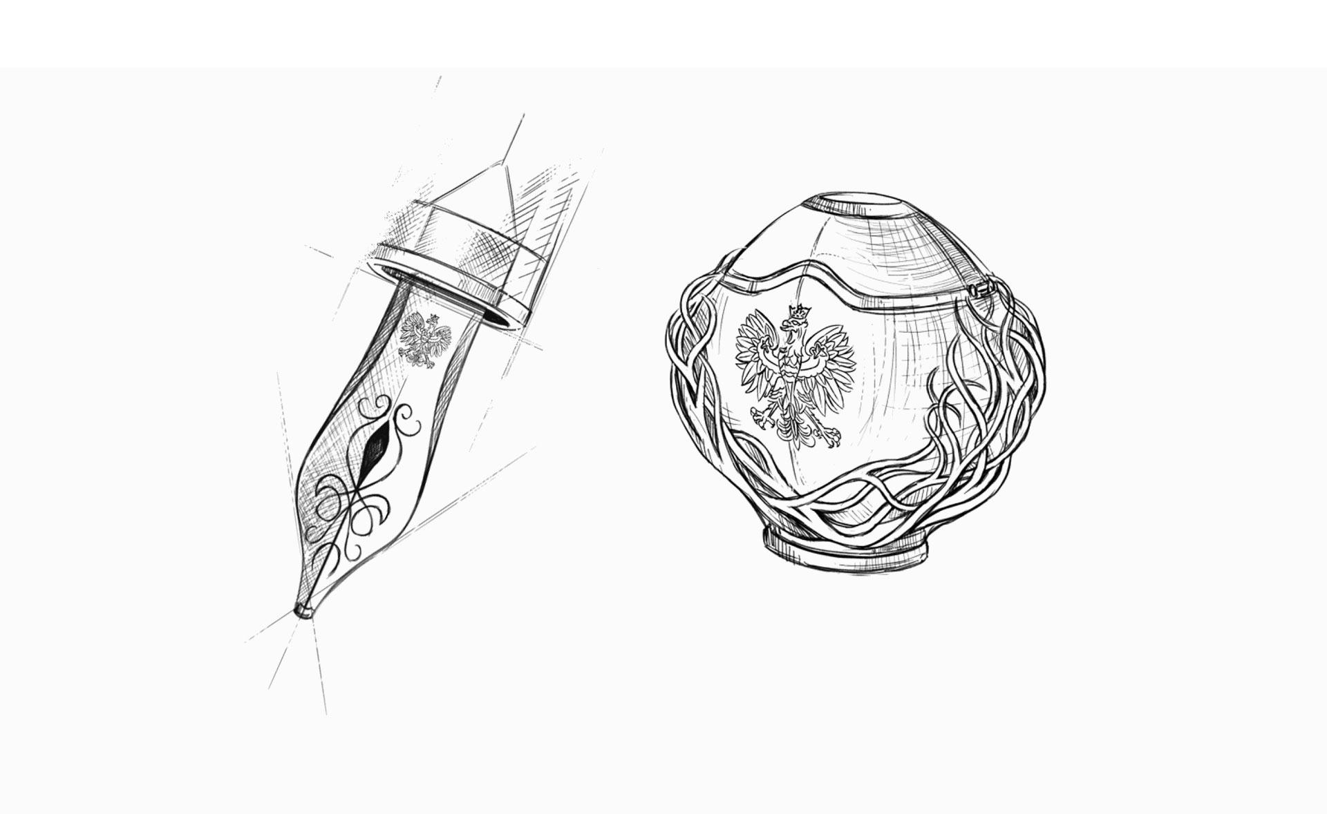
As a gift, we propose an eternal fountain pen, which is a symbolic representation of an eagle feather, clearly associated with our emblem. On the nib you can see the image of the White Eagle, while the tip of the handle in the form of tangled twigs symbolizing eagle’s nest. We have also designed an inkwell which, having similar aesthetic elements after opening, allows the pen to be positioned in a special protrusion for a century until it dries.
Handing this type of gift can be a kind of wish to continue saving the glorious pages of Polish history. However, when it is put on the hands of foreign delegations, it may symbolize the desire to continue writing together the history of Europe and the world.