Range of activities:
Branding
Mama i ja
The rebranding concept
Mama i ja
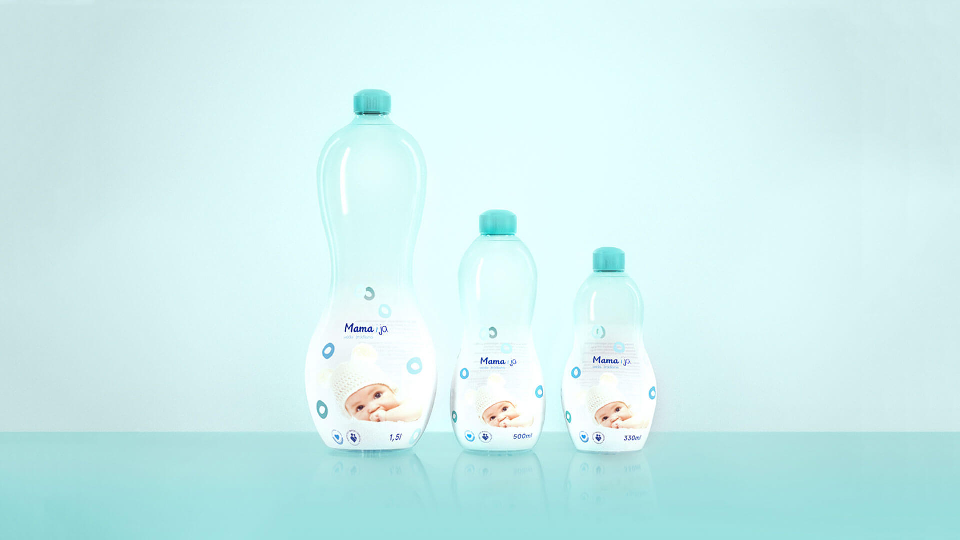
Mom and me is a company which cares about mothers and children. This kind of water is recommended for mom-to-be and new-born child. The market of water dedicated to moms and children is undifferentiated. The visual side of this market is scanty and it needs to be refresh. Nowadays, mothers are more independent and active than ten years ago. They need a professional support in taking care of the health.
Mom and me is a company which cares about mothers and children. This kind of water is recommended for mom-to-be and new-born child. The market of water dedicated to moms and children is undifferentiated. The visual side of this market is scanty and it needs to be refresh. Today’s mother is different from what it was ten years ago. She’s dynamic person – during pregnancy she often goes shopping, yoga-exercises, meets friends. Nowadays, mothers are more independent and active so they need a professional support in taking care of the health.
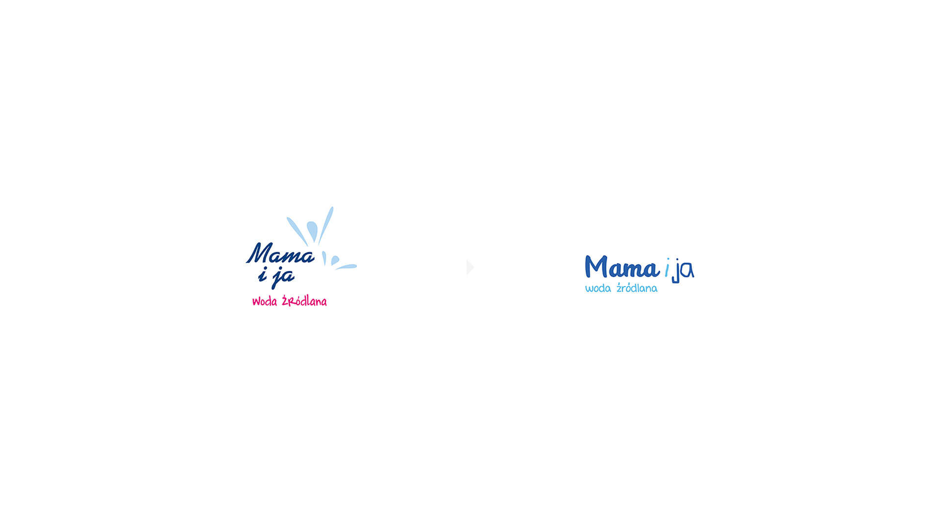
We created a typography which refers to both segments of the name. The first resembles woman’s handwriting and the second child’s handwriting. Rounded edges, softness of the font is coherent with company’s values.
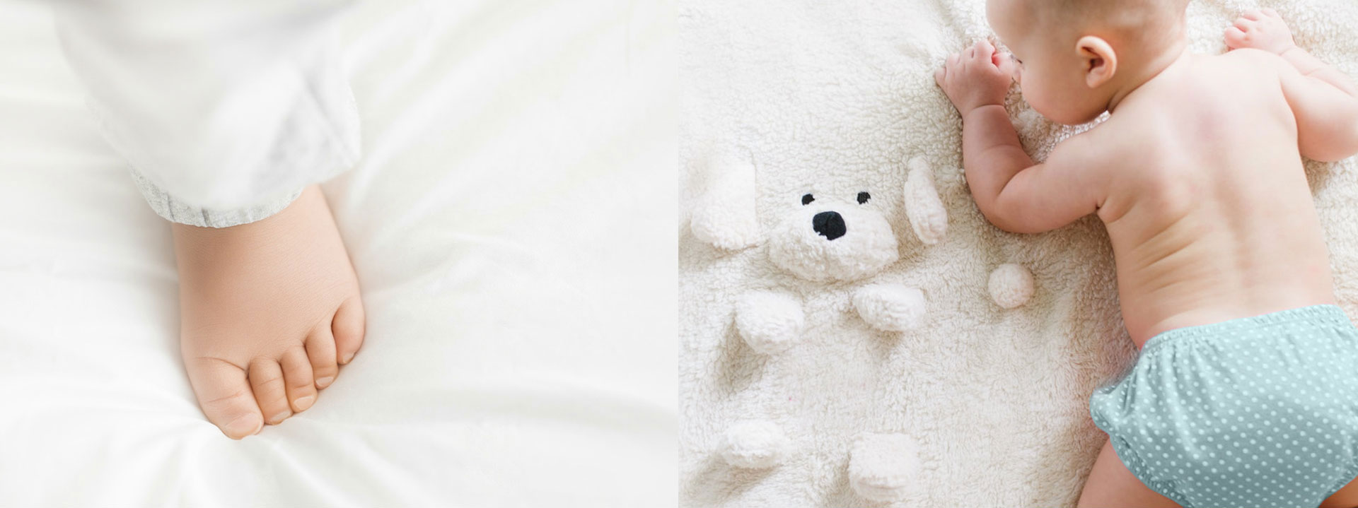
The child’s blanket is associated with safety and fragility a new-born child. It was an important association and inspiration during the creation of the entire project. It is something that gives a sense of security, caring and gentleness that is synonymous with a newborn child.
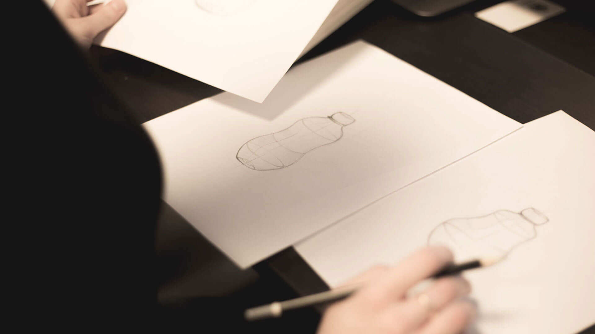
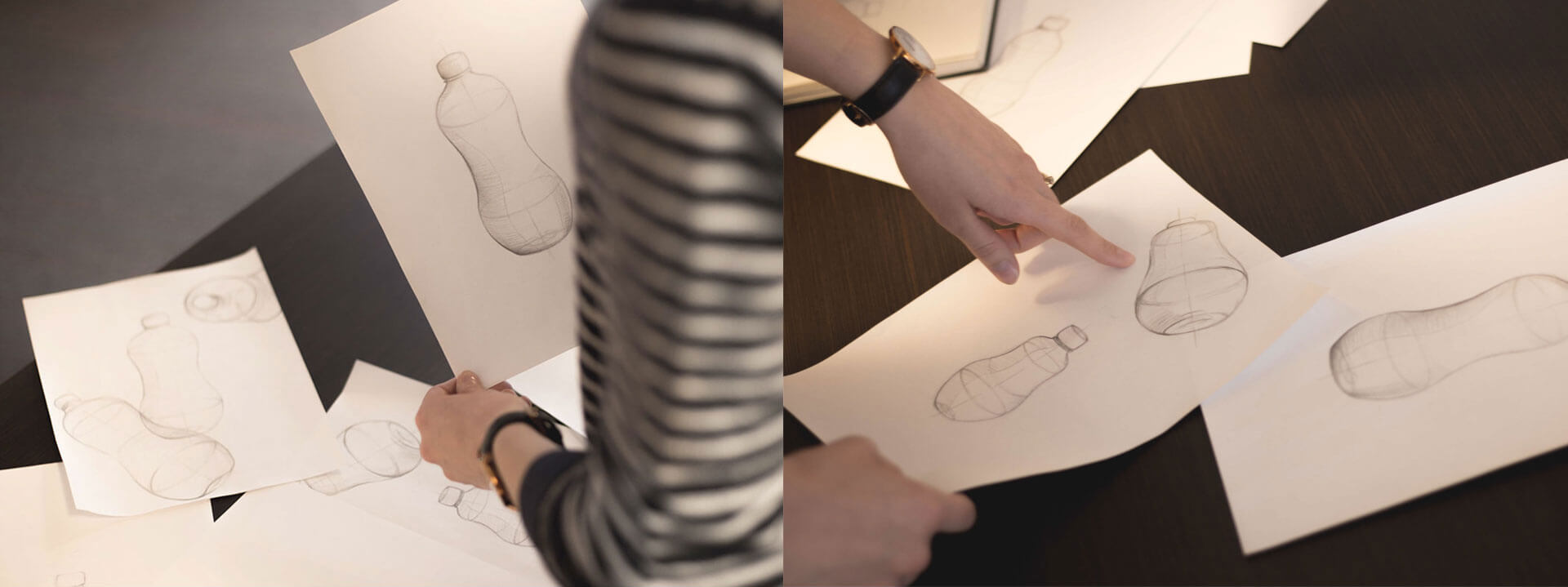
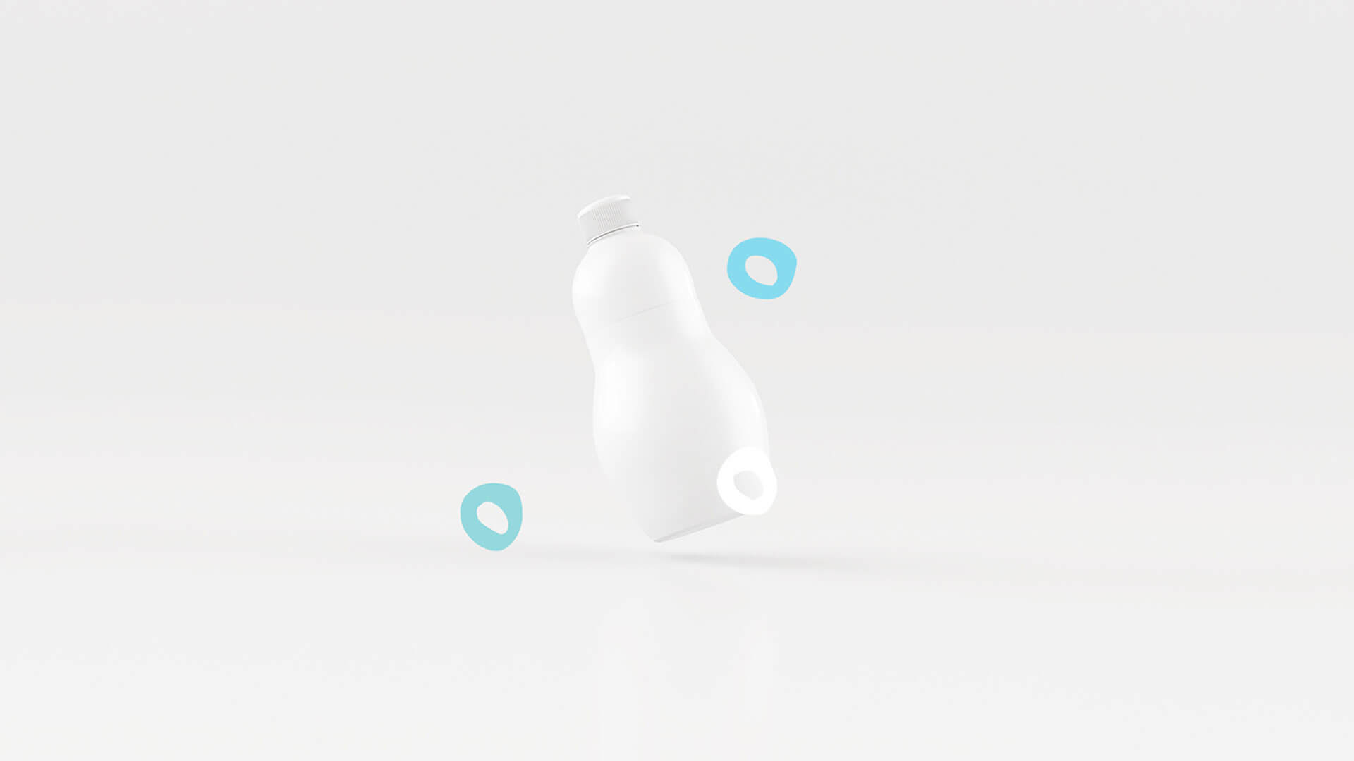
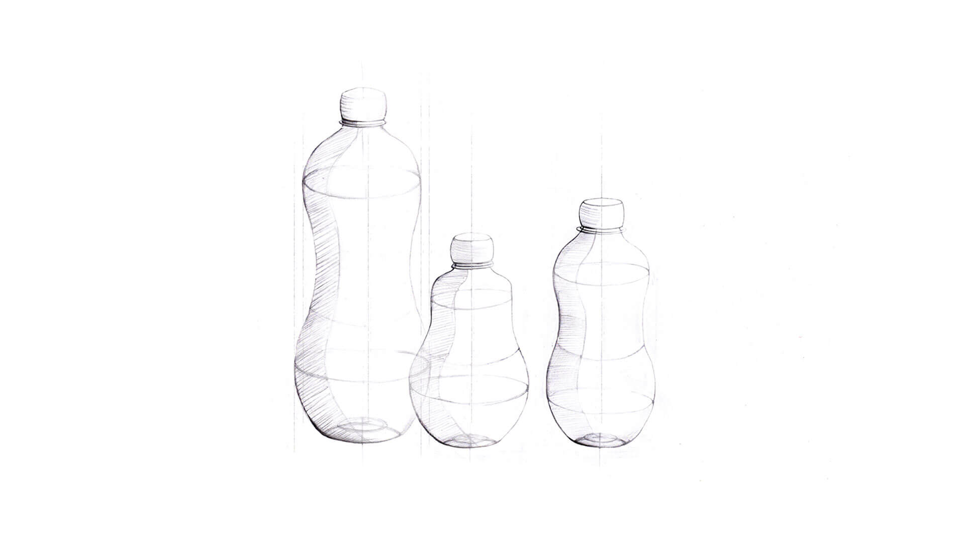
The streamline shape of the bottle is associated with woman’s body. Moreover it must be ergonomic and comfy to carry.
